
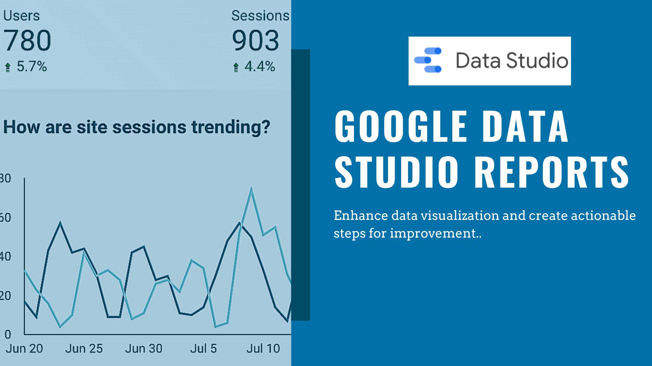
With marketers tapping into different sources to execute on their digital marketing strategies, Google Data Studio Reports can be a great way to combine all of the data and enhance your analysis of that data.
Whether you’re leveraging Google Analytics, YouTube Analytics, LinkedIn ads, Google Search, etc., you can customize and combine the data into a dashboard and enable your team to better visualize what is actually happening.
In this post, we’ll go through some examples of what the visualization might look like, what takeaways you might have from those visualizations, convenience of the Google Data Studio Reports, and how to best structure the dashboards.
Overview
Google Data Studio is a platform that enables you to connect multiple data sources with the ability to filter and customize which data you’d like to visualize.
A data source is simply where the data is coming from (Google Analytics, Google Sheets, LinkedIn, YouTube, Search Console, Etc.). Don’t be turned off if this sounds complex, developer skills aren’t required and Google has made it easy for beginners to start building reports.
Leveraging Connectors and Utilizing Data Sources
Google has ‘Connectors’, also known as access point integrations (API’s) to make it easy for you to add data sources to the platform. By clicking on ‘data sources’ within the dashboard, you’re able to see all of the data you’ve enabled access to within Google Data Studio.

Since we haven’t added any yet, you can click the create button shown above and will have access to a variety of data sources that you can pull from. To start, let’s add Google Analytics.

Now that we have our first connector set up, leverage a sample report to familiarize yourself with the platform. What the sample reports enable you to do is take sample data that Google has already created for you, and replace it with data from your data source. Once populated, you’ll have reports and a dashboard already built for you.
Within the template gallery of the main page, you’ll see 11 layouts already created and prepopulated with sample data:

By using the sample Acme Marketing Report, you can create a copy (file -> create copy) and populate the report with your own Google Analytics data (you must have already set up the connector in order for this to work correctly).
Once populated, you’ll be able to see your own reporting and start to customize the metrics, date ranges, filters, and segments in order to get the best visualization possible out of your report.

Now we can add another data source in order to identify correlations and better visualize the data. Because we’re not concerned about the geographical area of where our users are coming from in this example, we’ll remove it and add search console data in place of it.
You can add an additional data source by clicking ‘add data’ at the top of the page.

Sessions have increased over the past week, so by adding search console data, we’ll compare the sessions with our Avg. Position. Remember, Google Analytics data will show us how users perform on our website, while search console data shows us how those users found our site in the first place. Both datasets work hand-in-hand so it’s convenient to have them on one report.
It’s important to use the correct chart types depending on what you’re tracking (we’ll go over that later in the article). Because we’re tracking changes over time, a line chart or time series is best in this scenario.
Enhanced Data Visualization


Looking at the charts above, we’re seeing data from both Google Analytics (sessions trending) and data from Google Data Studio (Avg. Position). With the data combined, we’re able to better understand what is happening with our website and identify correlations.
In this example, we can see that as our avg. position moves up in rankings within search engines, our site sessions also start increasing. Conversely, as we fall behind in our avg. position ranking, site sessions drop as well.
This helps marketers easily visualize website performance, and implement actionable steps to improve their online presence. Here are some steps that a marketer might take back to their team to work on improvements based on the correlation.
- A further SEO audit: which pages are ranking well, and why?
- Where are you being outranked by competitors?
- What is the average duration users spend on your site?
- Do conversions correlate with this data as well?
Ultimately, this report helps you better understand where there’s room for improvement. From a high level, the single biggest takeaway here is that you’ll want to focus on improving your average position because you now know that as your ranking improves, your website gains more users (enhancements for what users do while actually on your website will need a whole new set of reporting).
Structuring Your Google Data Studio Reports
The way you structure the reporting is crucial. It’s important to keep things easy to read, but also provide more detail if you or a team member wants to dive further into the data. The same way you would structure a PowerPoint or Keynote, you’ll want to engage the viewers and ensure that your reports are easy to understand.
Highlight key data on the first page
The goal of these reports are to help you and your team better visualize and make sense of data. Whether you’re sharing these reports with your direct reports, or C-Level Executives, you’ll want your most important data to show on the first page.
For the report we created to track User Sessions vs. Avg. Position, we’ve shown that clearly on the first page of the report and have also utilized a scorecard so that the Avg. Position is even more visible.

Go into more detail on bottom pages of report
Referring to the steps for improvement based on the identified correlation, we can dive into further detail on the following pages to get even more granular with the data.
Tracking your top competitors (can be done by uploading custom data with Excel sheets), average duration on your site, and conversions will also help you better understand the actions a user takes online.
This makes the report accessible regardless of the audience. Management may not care about the same level of detail that the technical SEO team will.
Leverage similar color schemes to keep transparent
Google Data Studio offers theme and layout tabs where you can edit the look and feel of the reporting. You don’t have to be a designer to make the reports look appealing, but you should keep similar color schemes based on the data within the report.
For example, if your first page has a time series chart that breaks down how many users are on your website, and the second page shows how long those same users are on your website, viewers of the report might find it beneficial to look at the same color on each chart because it’s highlighting the same data.
Deploy the appropriate charts for datasets
You can best visualize the data when you’re using the appropriate charts depending on the data you’re looking at. To do that, you’ll have to understand which charts best track each dataset. Here’s a quick breakdown for you to reference.
- Bar Chart: Compare differences. Ex: how you acquire users (direct, organic, paid, etc.)
- Line chart: Track changes over time. Ex: changes in number of sessions
- Scorecard: highlight single metric. Ex: Avg. Position within search engines
- Pie Charts: Comparing parts of a whole, good for comparing two or 3 values. Ex: Comparing which devices users use the most on your site.
- Geomap: real world data visualization. Ex: Tracking the geographical location your users come from.
- Bubble charts: Identify correlations (or lack thereof). Ex: Correlations between bounce rate and session duration.
- Bullet Chart: Track performance against a target/benchmark. Ex: tracking sales data for the third quarter.
Build, Measure, & Improve
Start with using the sample reports that are already provided in order to familiarize yourself with how the actual reporting works. Once you have a better understanding of how to customize the data, you can get more granular and enhance your reporting.
As your reports evolve, so will the way you measure your online presence. As you continue to build and measure reporting, you’ll be able to improve your based on the data visualization and convenience that Google Data Studio reports offer.
Let us know how you’re best leveraging Google Data Studio!

Gary McConnell Co-founded Rubicom Digital in 2019 with a goal of providing digital marketing consulting services in the B2B space.
Gary continues to serve as the Marketing Director of a Data Center-focused IT Provider, VirtuIT Systems.